


Here are 9 techniques we use to make them easier to understand
No two commodities are alike, and each has different market dynamics.
Luckily, visuals such as charts, infographics, and data visualizations can help us approach commodities in a way that helps to improve your understanding of how they fit together.
Below, we’ll dive into 9 different visual or editorial techniques we’ve used to help explain commodity markets.
| Method #1: Charting the Macro View |
| Commodities are all physical goods with fundamentally different properties and uses. Wheat and soybeans can help satisfy our hunger – but obviously copper, crude oil, and platinum don’t fare well in the digestive system in large amounts. Despite individual commodities having many differences, as a whole, commodities react in similar ways to macroeconomic stimuli. And over history, commodity prices have often moved in the same general direction in what is called a commodity supercycle. |
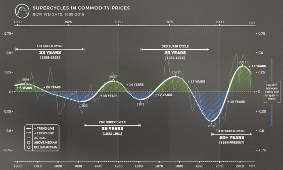
In the above chart, we sketch a trendline (initially charted by the Bank of Canada) that shows the general movement for commodity prices as a whole, compared to median levels.
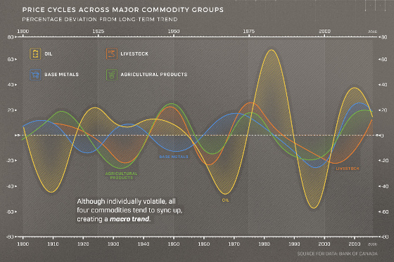
Here’s the same information – but this time grouped by individual commodity categories, like base metals, livestock, or crude oil:
See the full commodity super cycle infographic
| Method #2: Textbook-Style Geological Illustrations |
| This isn’t an original method, but it works. In our infographic on volcanogenic massive sulphide (VMS) deposits – we show how these base metal deposits form: |
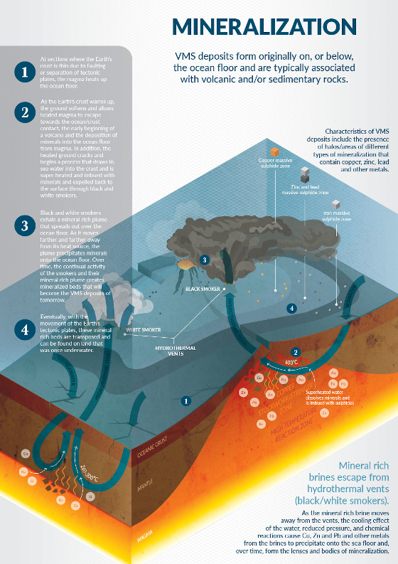
See the full VMS infographic
| Method #3: Data Visualization of a Powerful Takeaway |
| Did you know that nuclear is by far the safest energy source globally? With tragedies like Chernobyl or Fukushima as some of the first things you may think of when nuclear comes to mind, it’s a fact that’s hard to believe. To make an interesting case for the safety of nuclear, we visualized the amount of human deaths attributed to each major energy source, per unit of power generated. In this case, you’re looking at 100 deaths per TWh of energy generated: |
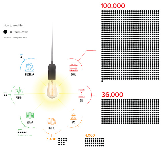
Nuclear generates so much power, that the rate of deaths per TWh is actually better than any other energy source.
>> See the full Safest Energy Source Visualization
| Method #4: Make It Tangible |
| Gold has an extremely high dollar value per ounce. The easiest way to understand this is to hold a physical gold coin that is worth US$1,600 – you can quickly extrapolate tangible information from this experience to «get it». In the digital world, it’s not as easy. But what if we visualized gold cubes next to objects you’ll recognize, corresponding to important dollar values (like U.S. median income, or $1 million?). |
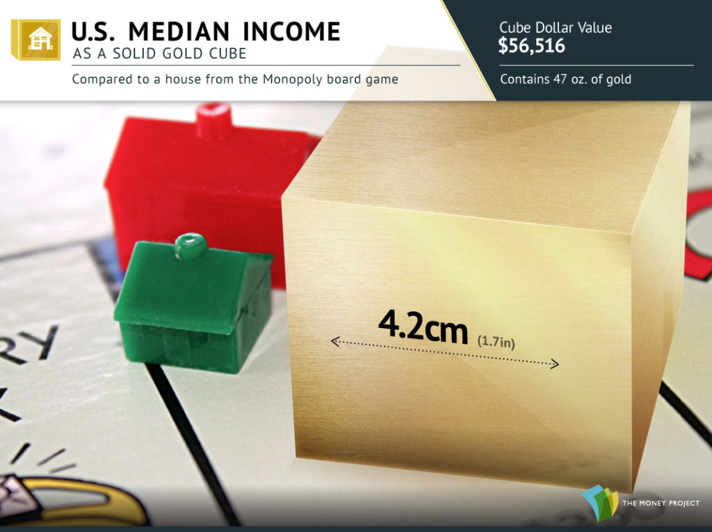
A gold cube that compares to the houses and hotels in the Monopoly board game is worth the same amount as the median U.S. household income.
Likewise, a million dollars is a cube of the yellow metal with 4″ (11 cm) on each side.

| >> See all 11 visualizations we made showing gold’s value and rarity Method #5: Map It, But Don’t Be Afraid to Take Chances |
| In the context of any standard world map, countries like Kuwait, Qatar, and the UAE are not likely to stand out because of their limited landmasses. But in terms of the global energy scene – they are all mighty players with considerable influence. The below map sizes countries not by their geography, but by their oil reserves: |
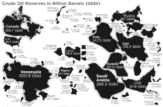
| The end result is almost unrecognizable, but it goes to show you that there is more than meets the eye when it comes to global energy. Small countries, especially in the Middle East, can punch above their weight. >> See the full resized oil reserves map Method #6: Categorize, When Necessary |
| The boom in renewable energy is interesting in that it will require the significant usage of many different metals to be possible. We could list 30+ key metals and materials needed to make lithium-ion batteries, electric cars, solar panels, and wind turbines, but it’s so much information that it would be overwhelming. Instead, this useful diagram categorizes the raw materials needed for green energy into four parts: hardware, electric motors, distribution & fuel, and energy storage. |
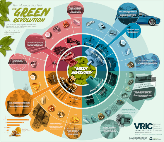
| >> See the raw materials that fuel the green revolution Method #7: Visualize the Science |
| Gold has been used as money for thousands of years. However, here is a different and perhaps more rational way to show why gold is money: by using the process of elimination on the periodic table. Check out this animation that eliminates unfit elements (i.e. too common, toxic, radioactive), until only gold remains: |
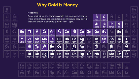
| >> See the periodic perspective on why gold is natural money Method #8: Build a Flow Diagram |
| How is energy generated, and how does it get used? This flow diagram has all the data – for every major energy source – for an entire year of U.S. energy consumption. Because it shows all flows, it has little ambiguity on a topic that can sometimes be divisive. |
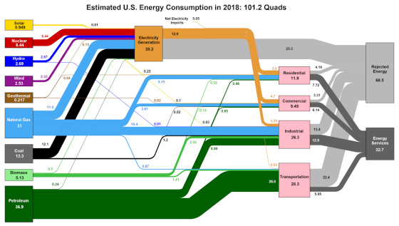
| >> See energy flows for the U.S. over 2018 Method #9: Comparing Apples to Apples |
| This is one of our favorite commodity-related diagrams on the site. As a disclaimer: it is a couple of years old, but the point is the same. The circle diagram below shows the comparative size of every major metal market in contrast to the oil market, with a pretty mind-blowing takeaway: the oil market is much, much bigger than all other metal markets combined, and it’s not even close. |
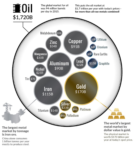
| If you’ve ever wondered why oil has influence on the economy, geopolitics, or any other facet of life, this diagram has a telling answer. It’s just so big, and it makes the gold market – or the iron market – seem puny in contrast. >> See the oil and metal market diagram |
| «You can longer buy commodities at Merrill Lynch. My guess is many analysts or even executives are too young to know how profitable a hot commodities market can be. They will soon.» – JIM ROGERS |
Copyright © 2020 Visual Capitalist, All rights reserved.
You are receiving this email because you are subscribed to VC+
Our mailing address is:
Visual Capitalist211 Columbia StreetSuite #100Vancouver, BC V6A 2R5Canada
